
The Complete Guide To Making Perfect Landing Pages
All you need to know about 🔨 creating killer landing pages that generate high sales 🛒🚀

No matter what business you’re in, good landing pages will always increase your sales. But creating good landing pages is a difficult task. That's why I made this guide. I hope to help you create the perfect landing page for your business.
First I will help you to get started quickly, by introducing a simple yet powerful model: pain-dream-fix . This model will help you to create brand new copy in minutes. Then we will analyze the most common landing page elements. Following industry best practice, I will help you to get the most out of each of those elements.
I will also share a ton of recommendations for additional optimizations. You don't have to apply them all, but make sure to bookmark this page so you can come back and optimize your landing page later.
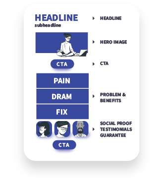
Those are the basic sections of the landing page we will be building:


Create copy fast with the pain-dream-fix model
Starting is always the hardest part. I was really impressed the first time I discovered the pain-dream-fix method. It's a very simple, yet powerful way to craft landing page copy. It’s also a perfect tool for breaking through that writer's block that we all experience.
But the biggest benefit of the pain-dream-fix model is that it helps you get started very quickly.
Use the pain-dream-fix model to rapidly create copy and basic structure for your landing page. Then get a perfect landing page, by enriching that structure with other landing page elements like CTAs, social proofs, supporting graphics, etc.
I have built this distraction-free tool to speed up your pain-dream-fix writing process. After you are done, click “Generate My PDF” to get a PDF version of your page copy. To keep the integrity of your idea, I have removed all tracking scripts from that page.
Pain
Every user comes to your page with a problem to solve. The pain section of your landing page shows the users that you are familiar with those problems. If you address the basic pain points that a user is experiencing, you have done your homework. Users will be drawn to your story. They will feel that you understand them, and so they will give you a chance to present your solution.
Focus on writing 1 to 3 pain points. If you struggle with finding them, create buyer persona first. Buyer personas make it much easier to think from a user's perspective.
Dream
A dream is a promise of a beautiful future. It's a picture of how things could be. In this section, we don’t mention our product yet. We are painting a perfect but real picture. Our main goal is to motivate users to ask “but how?”
Fix
The fix represents your product description. It is the bridge between the pain and the dream.
Example of how big brands use the pain-dream-fix model:
Hey.com plans to disrupt the email client market. Here’s how their idea responds to the pain-dream-fix model.
Pain
-
Inefficient email process.
We waste a lot of time on emails, going through spam and the general clutter of modern communication.
-
Privacy
All email clients spy on us and profit from selling our personal data.
Dream
Imagine a completely private email client, with a workflow that magically saves you a lot of time.
Fix
Hey helps you to sort emails with this magical process, freeing you from distraction and saving you a lot of time. Hey is completely private. Because we charge $99 for our service, we don't have to spy on you and sell your personal data. This means that we can turn off all spying mechanisms that other email clients (like Gmail) or email services (like MailChimp) use.
Headline
Your landing page headline explains what users are going to get, in a very clear and simple way. An effective headline usually includes the two biggest benefits of the products. Together with the sub-headline, they behave as perfect value propositions.
Here are some good examples:
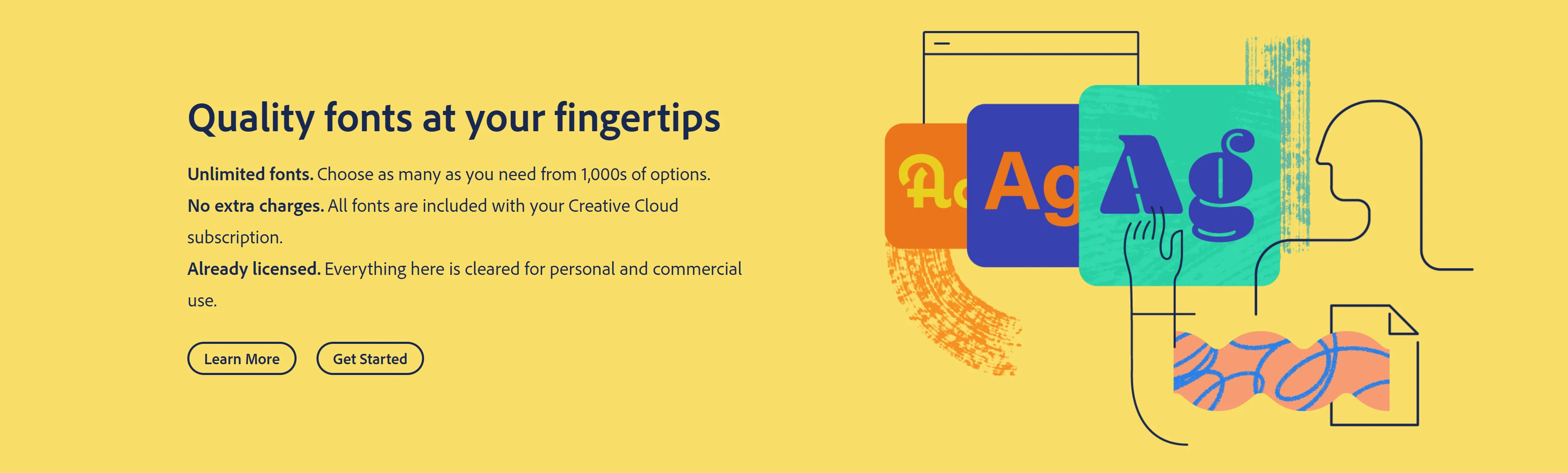
Adobe Fonts
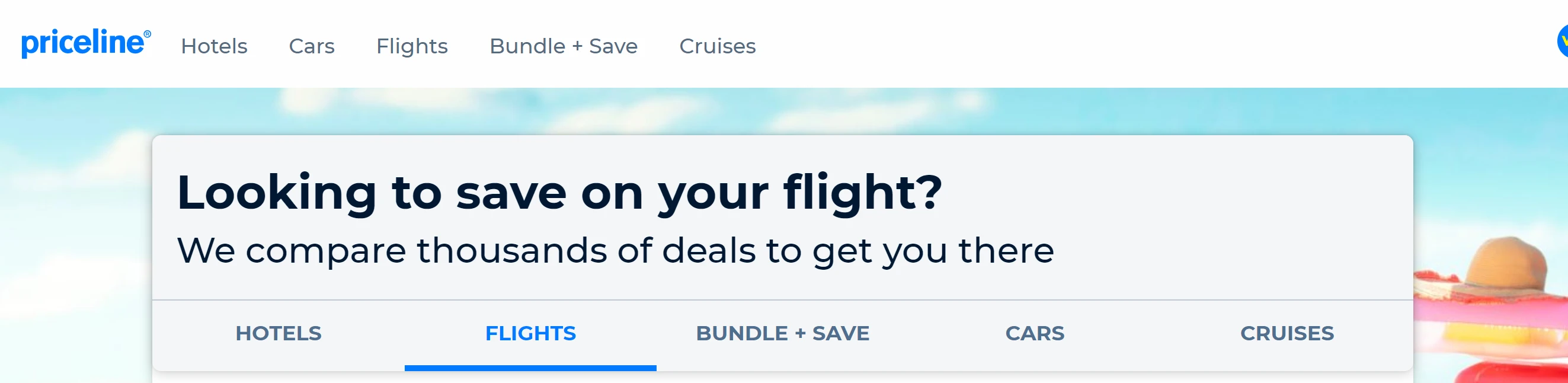
Priceline
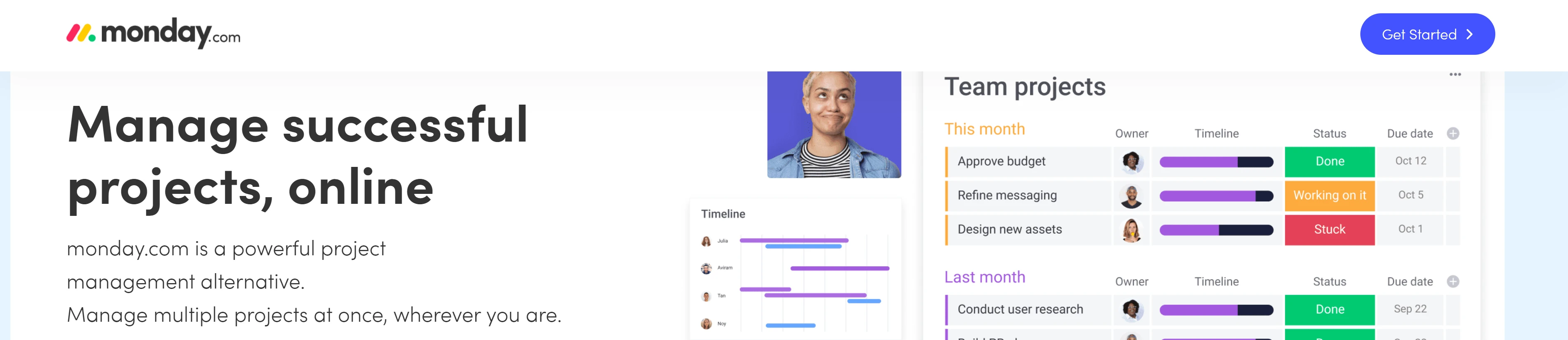
Monday
Hero Image: Smiles increase sales
A hero image is crucial in forming a great first impression. I usually advise businesses to hire photographers to get professional shots. I try my best to convince them not to use stock images for the hero section.
There is a famous story about the “Everywhere” girl. She has appeared in banner ads for Samsung, Microsoft, Greyhound and many more. In 2014, two competing buisnesses used her image at the same time, in their year back-to-school campaigns.
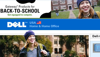
(credit https://cxl.com/blog/stock-photography-vs-real-photos-cant-use/)
Every stock image has been used multiple times on the web. A lot of them are used by scammers and low budget companies. Using stock images for the hero section shows your customer that you care very little about presenting your product. It gives them reasons not to trust your brand. I always try to avoid free stock photo sites like Pixabay and Unsplash for those reasons.
We only need one good shot. It should not be hard to take one good photo of people using our product.
In case you have to use stock images, using premium or exclusive services may be your best option. Consider places like:
- offset.com
- gettyimages.com or
- Adobe Stock Premium.
The slightly higher prices discourage most low budget and scam companies. After you buy the right image, use a skilled editor on Fiverr to edit it and adopt it to your brand.
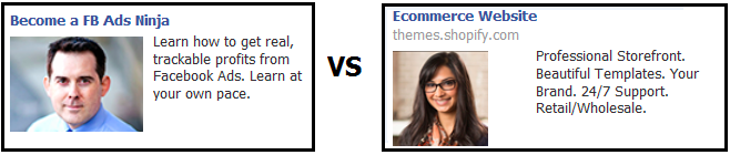
According to Wishpond, smiles can increase a software company’s profit by 10.7%.
Wishpond tested these two images and found that profit ended up being higher by 10.7% when they were using images of people smiling.
When using images of people, try placing the CTA so that the character’s eyeline draws attention to it. In other words, your visitors will look in the same direction as your models do. Search for “Using Directional Cues in Advertising” to learn more.
CTA
When it comes to effective call-to-action elements, there are three main rules you can follow:
- One CTA goes above the fold. Others are distributed alongside the page.
- Use strong contrast for the CTA.
- Use descriptive, personalized, action text for your CTAs.
Above the fold refers to the first section of your website that people see, without scrolling.
When suitable, use call to action phrases that are more relevant to the action customers are going to take. According to Hubspot's findings, personalized CTAs convert 202% better. Better crafted CTAs can increase your conversions. Instead of “Submit” use:
To increase conversion even more, we have repaced your with my.
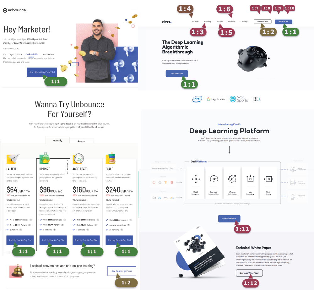
Keep the attention ration at 1:1
When creating CTAs, make sure to keep the attention ratio at 1:1. Each CTA on your page should lead to the same action.
The 1:1 attention ration is one of the simplest landing page rules that can skyrocket your conversions.
Remove navigation from landing pages to bring more attention to your CTAs
Hubspot carried out A/B testing across five of their landing pages to prove that removing navigation improves conversion rates. Here are the statistics they discovered:
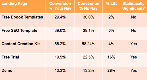
Career Point College reported an increase of 335% by removing the top navigation and modifying the form layout on their landing page.
Social proof: From Youtube Influencer to the New York Times
Before you start fidgeting nervously in your chair, I have to tell you that this is actually the simplest part of our journey. Many founders, especially in the tech startup world, fear this part the most. To them, it is a chicken and egg thing. “How can I get customers, without having customers?”
The whole strategy is explained in a simple phrase I dared to coin: "From Youtube Influencer to the New York Times".

Remarkable.com homage, 24th January 2021.
It’s based on the simple idea that you can ask or pay someone to review your product. By enlarging your user base, you are building momentum. Eventually, a research reporter will stumble upon your product and write a review. Then you would be able to quote the article and include the newspaper's logo in your testimonial sections.
Jason Fried, the creator of Hey.com, uses a social proof method that even companies on a small marketing budget can utilize.
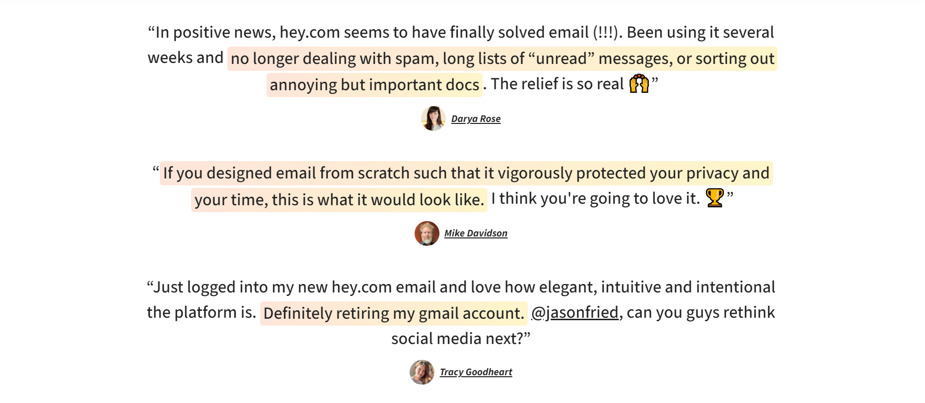
The screenshot of the Hey.com homage which I took on 24th January 2021.
Mighty Network is using an even more powerful version of this method. Their amazing marketing team came up with an idea to use case studies for testimonial purposes.
The screenshot of the Mighty Network homage which I took on 24th January 2021.
The idea is to start small. Share your product with your friends and coworkers. Try your best to create momentum. Eventually, you’ll work your way into magazines like Techcrunch, NewYorkTimes, Fortune, or similar. This gives you the ability to step up your game and take advantage of their brand recognition.
See how even Slack is trying to leverage off brands that are very well known to their users.
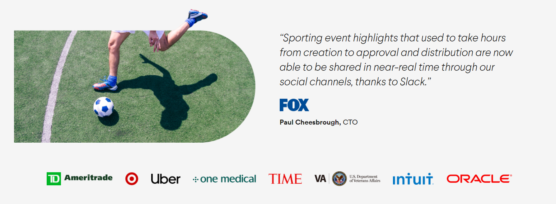
Slack.com, 24th January 2021.
And even Google needs some help when it comes to convincing its customers
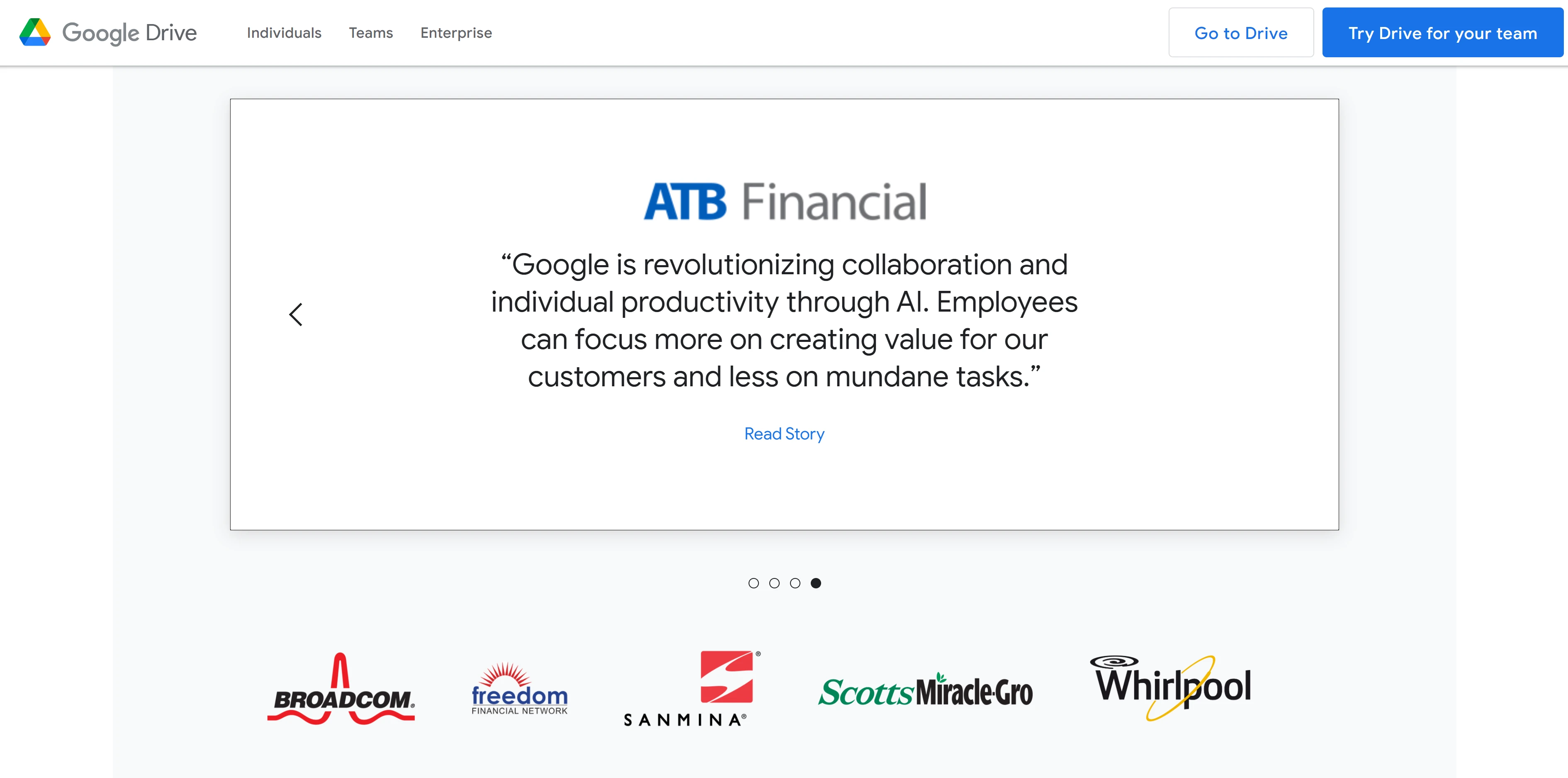
Google Drive landing page, 24th January 2021.
How to write your copy?
It’s best not to use a simple text editor when writing copy for your landing page. When writing copy, you have to be as close as you can be to the medium you are writing for. Don't try to imagine how you copy would look if it was added to a website. Try to write copy for that website from the start.
The use of simple text editors is responsible for some common mistakes. Your sentences will be too long. You wouldn't have enough headings for skim readers. Overall, your whole copy will just look as if it is not ready for the web. As a final result, you will spend too much time on editing.
At all times, you must have your website visitors in mind. It's very easy to get lost! Have the picture of your buyer's persona on the wall in front of you. You are writing for John. And John does not really care that we have a $100,000 printing machine. But some of the pros of having such a machine can be beneficial for John. He could get better quality prints. The machine also uses less ink, which means that there is an opportunity for a price reduction. Improved speed of printing also means that John can get his 10,000 papers printed today.
Notice that I didn't start this guide by explaining what a landing page actually is. I believe you have already covered the basics. I didn’t want to insult your intelligence by explaining to you the landing page concept. There is very little chance that you are going to build a “Perfect Landing Page” if you didn't even know what the landing page was when you started reading this article.
Is longer copy on my page better than shorter copy?
The length of our landing page copy depends on what your offer is. Test and you will find what length works best for your offer. Sometimes it’s beneficial to make a lot of short landing pages that target different groups in your audience. Some products require a lot of explainer articles and videos, or a lot of testimonials. My approach would be to build 3 short copy landing pages, and 1 with long copy. Then I would do A/B testing to see which one performs the best.
Create urgency
Scarcity works so well in marketing, that marketers even use it for digital products. It’s always been a mystery to me how there could be a limited supply of digital products.
There are much smarter ways of creating real scarcity. Sellers of digital products have the best luck with time limited deals and additional offerings (buckle, unbuckle). Offer additional customer support for the first few buyers. The first few testimonials are also of crucial importance to your product. Therefore, spending some extra time to help and to understand your first few buyers may be a very good thing.
Sale ends on __ !
The first ten people will receive __ !
Storytelling
Turn your copy into the story, and your page into the journey. The story flow which you are creating guides you from the problem towards the solution. Your story needs to be visually repeated on your landing page, too. By breaking the story into separate sections you will create a natural flow for the customers eyes when scrolling through your landing page.
The pain-dream-fix model is perfect for creating this flow. Supporting imagery and properly styled fonts can help this cause.
Build more landing pages
According to Hubspot’s research Lead Generation Lessons From 4,000 Businesses, businesses with 31 to 40 landing pages generated 7 times more leads than businesses with 1 to 5 landing pages.
How good landing pages will save you marketing bucks
If you are using CPC advertising, a good landing page can save you a lot of money. This is especially relevant to companies that are planning to advertise with Google Ads. In short, the more your targeted keywords are relevant to your landing page, the less you will have to pay for the targeted keywords (CPC price). I’ll give you a short example of why that is true.
Let’s imagine that we have two companies targeting the same keywords on Google Ads. The first company sells toothbrushes and the second one sells cars. The keyword they are both competing for is “toothbrush”. The company that sells cars has a much higher margin on its products. Also, they are aware that almost every person that is in the market for a toothbrush will eventually buy a car too. So why not outcompete the company that sells toothbrushes by offering high CPC for the word “toothbrush”.
This is where landing page relevance and Google algorithm comes into play. The landing page of the toothbrush company is much more relevant to the term “toothbrush”. Because of that relevance, Google will allow it to compete with less money for CPC. To be first in Google results for the word “toothbrush”, the car company will need to pay $10 for CPC, while the toothbrush company will only need to pay $1.
To take full advantage of the algorithm, you need to make your page as relevant to the advertising terms as you can. For making landing pages relevant to search terms, you would use the same rules as you would to optimize it for SEO.
To take full advantage of the algorithm, you need to make your page as relevant to the advertising terms as you can. For making landing pages relevant to search terms, you would use the same rules as you would to optimize it for SEO.
Making your page more relevant to your advertising terms will save you money in the long run.
The persuasive power of videos
More than half of B2B and B2C marketers use videos in their marketing. The reason behind it is that videos have much stronger persuasive powers than photos or text. Landing pages using videos show conversion rates up to 66% higher than average, according to aberdeen.
The most common types of videos on landing pages are Explainer Videos and Testimonial Videos. Explainer videos, sometimes presented as animated gifs, are a very powerful tool when explaining the use of a product. At the same time, testimonial videos are very hard and expensive to make.
As imperfect execution is better than no execution, I would advise you to first start with photos, and replace them with videos over time. This would also be a good test case to see the conversion benefits that video could bring to your industry. Please share your findings with me. I’m curious to hear the results and I would love to feature your story in my case studies.
The power of personalized landing pages
Personalization is one of those tools every marketer uses. Alongside personalizing products, you can also personalize your landing page copy. Here are some creative examples:
Instead of saying: “ Top Cheap Cars for Sale in Boston, MA ” be more personal, and try:
13 people from Boston bought a Toyota Prius from Acme!
or
10 millennials from Boston gave a Toyota Prius from Acme 5 stars!
Or go even more specific:
Two young marketers from Boston claim this Toyota Prius is ideal for navigating North
End’s narrow streets.
Let’s be honest here. If your customers already searched the term “buy Toyota Prius” or “Toyota Prius sale” why bombard them with generic messages like “cheap cars for sale”?
Millennial brains are already wired to ignore phrases like “ cheap ___ for sale ”. They simply glide through ads and see only organic content. Please, ask me how I know!
Tip 1: Google Ads allows you to target audience by zip code
Tip 2: Facebook Ads enable you to target the audience by age, zip code, profession, or interest
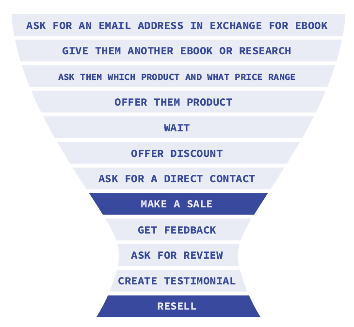
Carefully choose your conversion!
Asking your users to buy a product from your landing page is almost like proposing on your first meeting. Maybe ask for an email address or phone call first? Don't force the sale, try to push them into the funnel. Nobody buys straight from the landing page. We need to get a foot in the door first.
Try to gather hot leads with your landing page. Most of the marketers will offer something for free. Rental apartment seekers will like to see city neighborhoods ranked by safety. Car buyers will appreciate a list of the most reliable cars in 2021. Marketers and developers will fall for ebooks or a guide. Sorry, but we do!
Once they get to your list and show purchasing intention they are hot leads. You can raise the price you are paying for PPC for these leads. And the best thing is that nobody on the internet knows that they are a hot lead for your product. This means that you are able to target them and successfully compete for their attention!
How and where and how to look for inspiration?
Use WayBack Machine to look at the early beginnings of current giants. I always wonder how Uber, AirBnB or Facebook started. A few decades ago, Uber was just an ugly baby. They needed good landing pages to get their first users.
Now everyone knows what Uber is, and they no longer use the same techniques. Now they have to take care about investors and public image. Before they only cared about increasing the number of users, conversion.
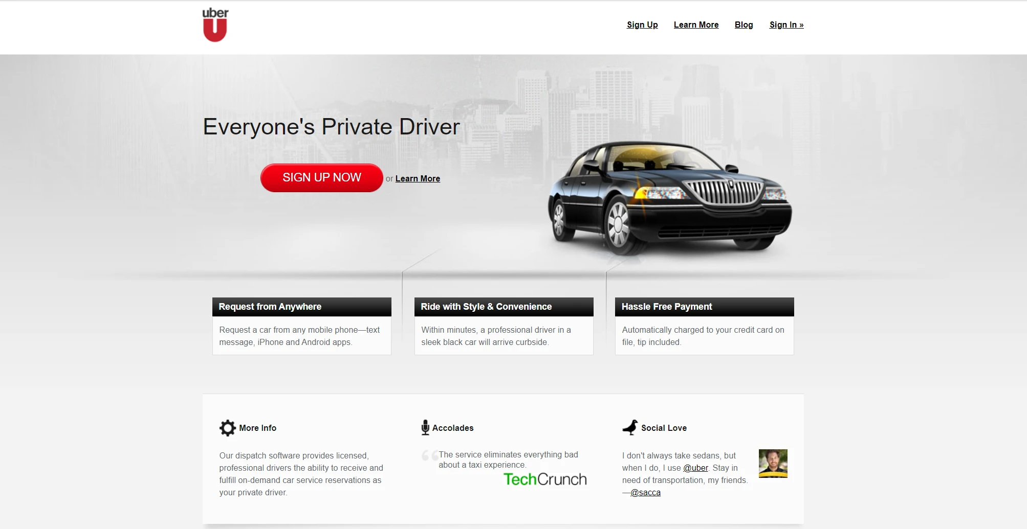
Uber homepage in 2011
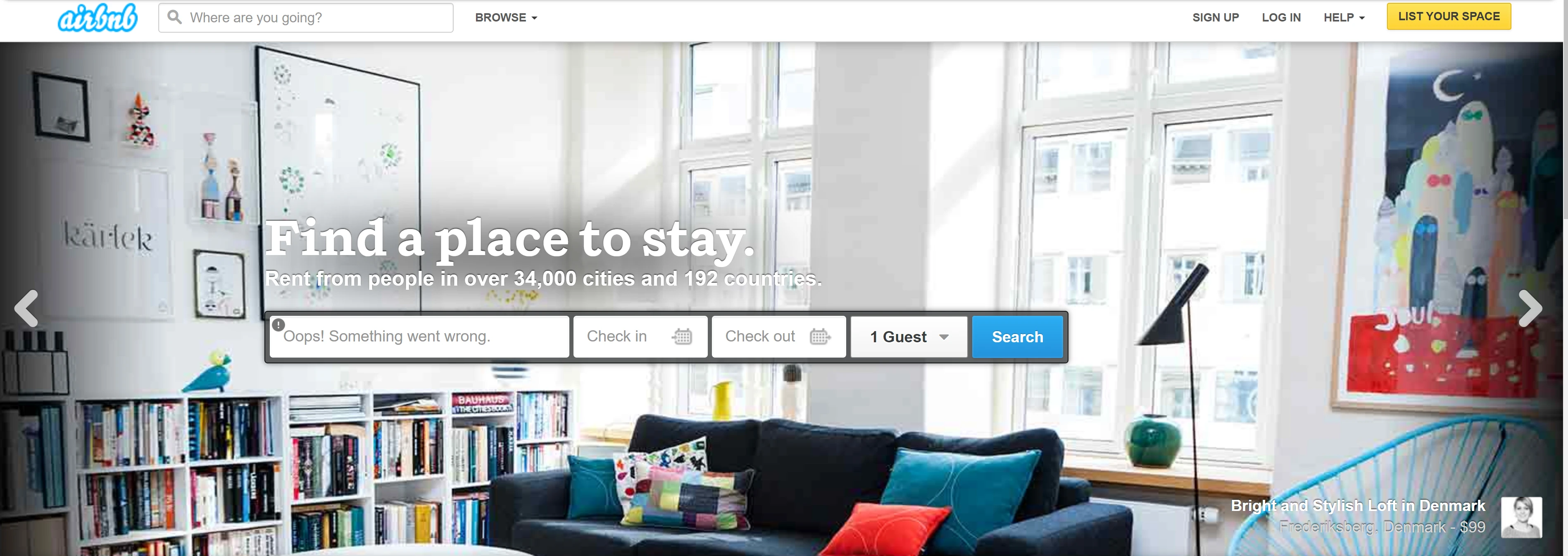
Airbnb homepage in 2011
Use Adobe gallery when looking for contemporary and futuristic site examples.
Research by analyzing competitors (product, size, audience) - when building your landing pages, be at least as good as your competitor. Your competitors can tell you a lot. They can define your users, and therefore what kind of landing page works best for you.
CODE:
Optimize for Speed
The speed of your website influences two major quality factors for your landing page: your user experience and your Google rankings.
Speed and user experience
Users happen to be allergic to slow-loading websites. If our website is slow, they may even leave it before we get a chance to introduce our offer. According to Google’s own research, 53% of mobile users leave a site that takes longer than 3 seconds to load
Speed and ranking
Google has made it public that speed is one of Google’s ranking factors. It caused major confusion among SEO experts that faster websites are better ranked in Google. That is not actually the case, and it can be easily tested.
I tested this theory and got interesting results. I used the term “landing page guide” and tested the first 30 results I found on Google. As a testing tool, I have used Google's lighthouse, which you can find at web.dev. Results on page 3 of Google SERP were almost 2x faster than websites offered on Page 1 and Page 2.
So Google is not actually ranking faster websites more highly. What Google is doing is penalizing websites that are much slower than the average.
This means you have to make your landing page faster than your industry’s standard. Based on 30 pages of results on the term “landing page guide”, I have calculated that my page needs to accomplish the following category standards:
First Contentful Paint < 3.1s;
Time to Interactive < 15.5s
How to make your landing page load faster
Luckily, making pages that load fast is not hard at all. These rules will help you:
- Properly size images and use the right image format. Use as many SVG graphics as you can. Use PNG for images with a small color palette and JPG when working with highly detailed photos.
- Remove unused code and move all CSS and JavaScript into one file. Tools like Webpack and Parcel can help automate this process.
- Use Minify on JavaScript and CSS files
- Defer offscreen images with lazy loading. Lazy loading is a technique of loading images. Only images above the fold are loaded with the page. The rest of the images are loaded once you start scrolling toward them. Newer Chrome versions automatically apply lazy loading.
- Use CDN. You can use CDN to deliver photos or code libraries. If I’m using the Bootstrap framework, I’ll get CSS and JavaScript files from their CDN network. This increases the chances that a user will already have the file saved in his browser cache.
- Avoid CSS animation or other processor-heavy actions on your landing page.
- Consider using static site generators like Gatsby or Next.js for making fast-loading landing pages.
- Stay away from carousels, they are bad practice in general.
- Optimize your above the fold section to load quickly.
- Place your Google Analytics code at the end of the page, or delay loading. Google advises you to place GA code at the beginning of your code, so it can track user behavior the moment they start loading your page. But this slows the loading time of your page.
Improve the reading experience
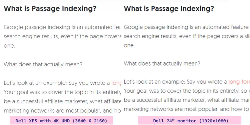
Neil Patel is using a font that is too thin in his article. This thin font looks good on high pixel density screens (left) but it makes for a bad reading experience on low pixel destiny screens (right).
This example from industry leader Neil Patel shows how a poor reading experience can happen even to the best of us. The left side is how the text in his article is presented on my expensive Dell XPS with 4k resolution. The right image is how it looks on my cheap external monitor with a resolution of 1920x1080, spread over a 24’’ screen. While the style he achieves with contrasting bold and light fonts is astonishing, the reading experience really suffers.
Five rules for achieving better reading experience:
- Set the font size for desktop and mobile separately
- Set the appropriate max width to your article wrapper, so your lines are not too wide
- Play with the line height
- Change the font width
- Establish a hierarchy - use thin, dark gray text for article text, and dark, bold text for headers
Never stop testing
Google’s Lighthouse has become a standard tool for performance and accessibility testing. My go-to website for various kinds of free testing tools is UITest. UITest has a collection of more than 200 free web-based tools for website testing.
When doing a quick project estimate, I’ll analyze my clients and their competitors by using these four methods/tools:
- Lighthouse
- CMS Detectors (WP Theme Detector,WordPress Plugin Detector)
- Number of indexed pages (by searching “site:competitorsSite.com”)
- SEO score with Moz.com and Ubersuggest
If competitor scores are too low, I’m more confident in guaranteeing an increase in conversion. Stronger competitors can reveal to me what parts of the landing page I should optimize first.
When the client has better performing websites, I concentrate on creating a better on-page experience for users and on creating more content.
Design for reusability
Landing pages are the least constant pieces of your web presentation. You will be changing them frequently. Editing is mostly done for testing purposes. Therefore, they need to be made with clean and simple code. Using CSS variables or SASS can speed up the building process for creating those tests.
SEO is still important
You may ask yourself, is SEO still important in 2021? 100% yes. SEO used to be optimization for search engines, hence the name. Now SEO is optimization for user experience. Search engines have become such good estimators of user experience that now, by optimizing for SEO we actually optimize for a better user experience.
It used to be important how many backlinks you got to your page. Now it’s important how many users come your way through those links. In other words, how important your page really is for real people.
Let’s imagine that you are selling a programming course on JavaScript. A user searches for “programming course javascript” and visits your page. Google then analyzes the time the user has spent on your page. If a user stayed on your page for only 2 seconds and moved back to search results then he probably didn’t find what he was looking for.
This is a classic example of how SEO became more about optimizing for the user than optimizing for search engines.
SEO also plays a crucial part in the price of PPC campaigns. A page that ranks highly on search engines for specific terms, will also have low PPC rates for the those terms. This means that we would be able to get more visits for the same budget.
When doing SEO, I usually refer to Brian Dean’s 200 Ranking Factors. I cherry pick the factors that have greater impact on the overall user experience.
Poor mobile optimization can cost you serious sales
Surprisingly, even in 2020, 84% of consumers still experience difficulty with mobile optimized pages. Moreover, 40% of users are so frustrated that they would go to a competitor after a bad mobile experience.
Providing a good mobile experience is not just a web developer’s job. Web developers can help make your page responsive, but creating a great mobile experience is a task for the whole team. Here are the most common mistakes:
- Reading experience is poor. The font scales badly - it’s either too small or too big for mobile devices. Sentences are too long. There is no padding between the mobile borders and text is easily covered by your palms when holding the device. You need to read and edit your copy on mobile screens. Don’t just use 30’’ giant monitors, if 70% of your readers come from mobile.
- Elements that work on the desktop don't work on mobile. A common case is that none of the explainer videos or animations from desktop versions will work on the mobile. The page is optimized for click events, but not for tap events which are used on mobile.
- Page sections are not in the right order. Three boxes on desktop versions may work great next to each other, but they are terrible when being stacked in one column in a mobile view.
- Headline not connected to paragraphs or elements it semantically belongs to. This is one of the first things I notice on many landing pages. Here are some examples of how to do it correctly.
Some techniques to consider when creating for mobile
Explore mobile-first design. This approach has been used for many years now. It's a web design approach where you design for the mobile view first, then you adapt that page for wide screens. So instead of making a desktop version of your website first, then making it responsive, you start by creating a mobile-ready page.
If 80% of your visitors come from mobile, and you make more than 50% of sales/conversion of mobile, there is no reason to use the desktop-first approach.
Be aware of mobile screen real estate. You don’t need to show the whole lengthy copy on the mobile phone. Save some info for the later in the funnel. Mobile users prefer shorter sentences and shorter text copies. You will find many more skim readers in the mobile world.
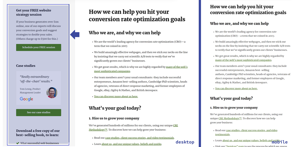
The Mobile version of your website does not need to have the same content as your desktop version. Notice how Conversions Rate Experts completely hide sections of their websites when the website is loaded in mobile view.
Design for web, not paper. A good book is a page turner, a good landing copy is a page scroller. - Tweet this.
I hope that I have solved your confusion about landing pages, which the internet jungle may have caused. Hopefully, you started with a vague idea of what you want to offer and ended up with a bulletproof plan for creating a perfect landing page. So instead of 1 landing page, you have a plan for at least 10. Instead of naive expectancy of sales, you plan to utilize the power of the sales funnel. Instead of sales, you now optimize for conversion. And for a long term relationship with every customer, that guarantees many sales.
I will keep updating this guide. If you find it helpful or interesting, please share.